I was reading a paper on calculation of sample sizes, and I inevitably came across the topic of statistical power. Essentially, when you’re designing on experiment, the sample size is an important factor to consider due to limiting resources. You want to have a sample size that is neither too small (which could result in high chance of failure to detect true differences) nor too big (potential waste of resources, albeit yielding better estimation).
It is useful to know the lowest sample size of a test that will detect real difference, if it exists, with a high probability. If I can provide a closed form solution for a statistical power, given the null and alternative hypothesis as well as \(\alpha\) cutoff (Type I Error Rate), calculating the required sample size would be trivial (like actually trivial unlike the “trivial” proofs in abstract algebra texts).
In addition to learning more about power, this should be a good practice to think about the relationship between the null and alternative distributions, and understand the different types of errors.
Definition
Statistical power quantifies the ability of a test to reject the null hypothesis when the alternative is actually true. More power means that you have higher probability of detecting a difference when there is a difference in the underlying population. \[Power = P(\text{Reject }H_0 | H_1\text{ True})\]
Let’s compare this to the significance level. \[\text{Significance Level} = P(\text{Reject }H_0 | H_0\text{ True})\]
p-value of a test is compared to this value to determine if the result is statistically significant.
Power is also called a true positive rate, the rate at which the true positive phenomenon is detected. A complement to this would be false negative rate (Type II Error Rate), a rate at which the true positive phenomenon is not detected.
In statistics, the convention is to denote the false negative rate as \(\beta\). Following this, the power is denoted as \(1-\beta\)
Significance level is a true positive rate. It is the rate at which a test detects a positive phenomenon when there is none present. Think about The Boy Who Cried Wolf, who kept falsely alerting the villagers of a wolf’s presence although the wolf was nowhere to be seen. That is a false positive call. The null hypothesis assumes that there is no wolf to begin with, but the test could still cry out “Wooooolf!”. The rate at which the test makes this error is usually denoted \(\alpha\) in statistics.
You can see that the difference between the two values lies in the underlying distribution.
Visualizing the Difference
Imagine that I am conducting a study and I have N samples. I want to test the means, and with CLT, I draw up a normal curve that represents the distribution of sample mean.

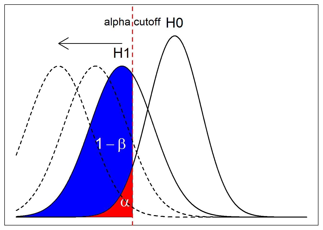
Assume that I’m doing a lower-tail test. Here, you see two graphs, each representing the null distribution (\(H_0\)) and alternative distribution (\(H_1\)). The alpha cutoff, indicated by the red dashed line indicates the test statistic at which the test result will come out as significant at \(\alpha\). In other words, if the result comes out more extreme than this value, the test is significant at \(\alpha\). Otherwise it isn’t.
The red area, which equals to \(\alpha\) itself, is bounded by the cut off value and the null curve (\(H_0\)). It indicates the probability of getting a more extreme result than the cutoff, assuming that the null curve is the true curve.
On the contrary, the blue curve, which equals to \(1-\beta\), is bounded by the cutoff and the alternative curve. If we were to assume that the alternative curve is the true underlying curve, then the blue area is the probability of getting more extreme result than the cutoff.
What Affects Power?
With the illustrations, you can kind of see the trade off you make between power and significance level. You may want to make the test stricter by lowering \(\alpha\), thereby shifting the cutoff to the left. But that would also result in hefty decrease in \(1-\beta\).
You can also see that the relative positions of the curves matter. If the magnitude of the difference between the null curve and the alternative curves are farther apart, then, at the same significance level, power would be much higher. What I mean ny the relative positions of the curves is how different the alternative hypothesis is from the null hypothesis. This can be decided from an experimenter’s desired effect size.
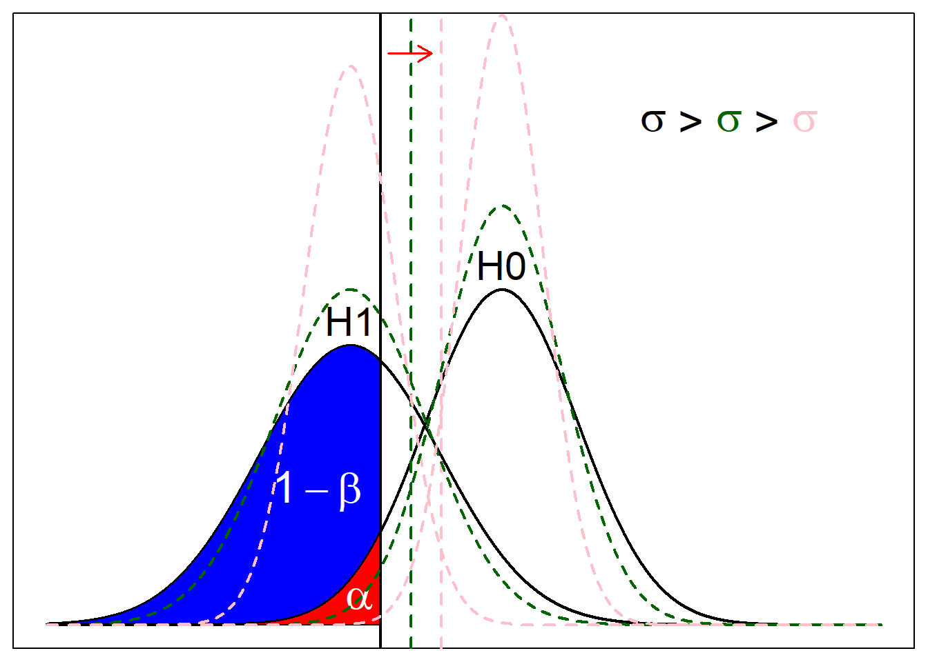
Another observation from this is that shape of the the distributions matter. For example, since these curves are Gaussian distributions resulting from CLT, the variance depends on the sample size N. It is inversely proportional, meaning that the higher sample size leads to lower variance, making the distribution more clustered around the mean. Imagine pinching the tip of the distribution and pulling it up; the threshold to meet alpha cutoff should go closer to the mean of null distribution (indicated by red arrow in next figure), and more “area” of the alternative should be around alternative distribution and beyond the cutoff. The colors indicate the changes in the null curve, alternative curve, and signifiance level cutoff according to sample size.
Power Calculation

Calculating the power of a test is fairly simple once divided into steps. Power is calculated based on the significance threshold and the alternative curve. So I’ll first have to calculate the threshold, which is determined by the null distribution. Once the threshold is calculated, I identify the overlap between the area of rejecting the null hypothsis and the area of the alternative distribution.
- Identify null distribution and alternative distribution.
- Calculate threshold at significance level \(\alpha\) under null distribution.
- Calculate the area under alternative distribution beyond the cutoff.
Example with a One Sample Proportion Study
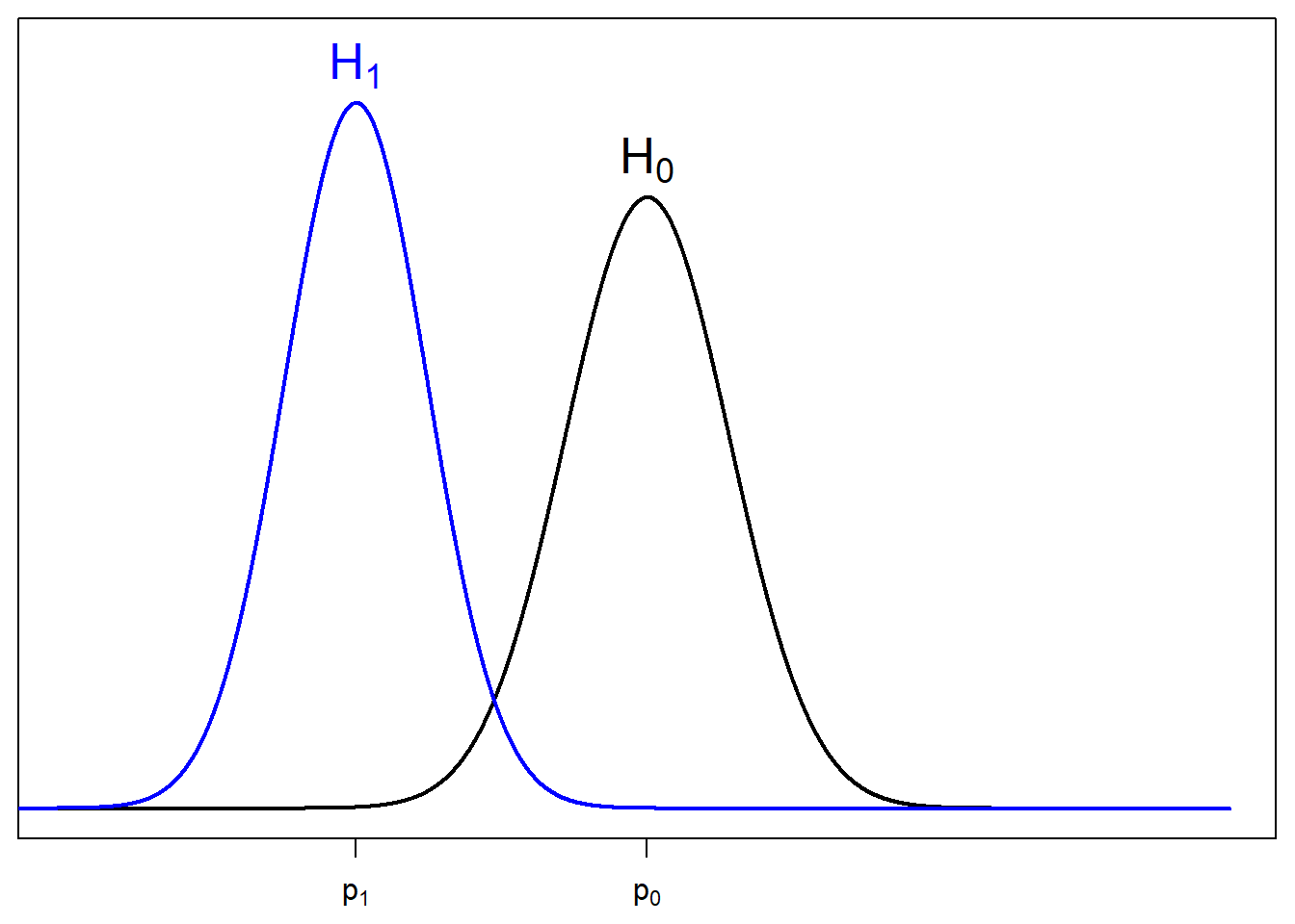
I will assume a one sample proportion test for equality. Suppose I want to study the proportion of people that like statistics. If I want to test that chances of liking or not liking are not equal, then \(H_0: p_0 = 0.5\) and \(H_1: p_0 \neq 0.5\). Let \(p_1\) denote the desired effect size. This is the proportion of the population if \(H_0\) were not true, and some other value than \(p_0\) is the true proportion. Imagine that I asked \(N\) people. \(n_1\) answered yes and \(n_2\) answered no.
Summary:
\[H_0: p_0 = 0.5\] \[H_1: p_0 \neq 0.5\] \[p_1 = \text{desired effect size}\]
\[\text{Sample Size} = N = n_1 + n_2\]
\[\hat{p} = \frac{n_1}{N}\]
Because the hypotheses test for equality, the test will be a two-tailed test.
1. Identify Null & Alternative Distribution
Under null hypothesis, due to CLT, the sample proportion should follow a normal distribution, where
\[\mu_0 = p_0\]
\[\sigma_0^2 = \frac{1}{N}p_0(1-p_0)\]
because the result is sampled from bernoulli distribution (response is either yes or no) with probability of success being \(p_0\), and averaged by the number of samples.
hence \[\hat{p}_0 \sim N(p_0, \frac{1}{N}p_0(1-p_0))\]
Similarly, under alternative hypothesis, \[\hat{p}_1 \sim N(p_0, \frac{1}{N}p_1(1-p_1))\]
The null curve is colored in black and the alternative curve is colored in blue.
2. Calculate Cutoff at \(\alpha\)
Now, I want to find the cutoff that make the significance level equal to some prespecified \(\alpha\). Usually this is chosen to be 0.05.
To calculate this value, we first focus on the null curve, because this is where the significance level is applied.
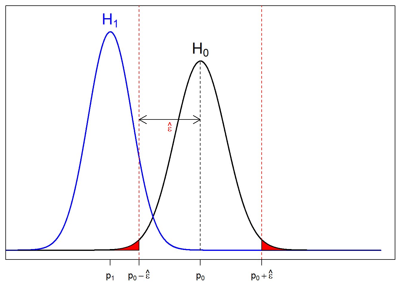
We want to make the red area equal to \(\alpha\).
Let \(\hat{\epsilon} = |\hat{p} - p|\). Then we want to find \(\hat{\epsilon}\) such that \(2\Phi\Big(\dfrac{((p_0-\hat{\epsilon}) - p_0)\sqrt{n}}{\sqrt{p_0(1-p_0)}}\Big) = \alpha\), where \(\Phi\) is a c.d.f. of a standard normal distribution.
\[2\Phi\Big(\dfrac{-\hat{\epsilon}\sqrt{n}}{\sqrt{p_0(1-p_0)}}\Big) = \alpha\] \[\Rightarrow\hat{\epsilon} = \dfrac{\Phi^{-1}(\frac{\alpha}{2})\sqrt{p_0(1-p_0)}}{\sqrt{n}}\] Then the lower tail and upper tail cutoff, \(p_{c^-}\) and \(p_{c^+}\) respectively, are:
\[p_{c^-} = p_0 - \hat{\epsilon}\] \[p_{c^+} = p_0 + \hat{\epsilon}\]
3. Calculate Area Under \(H_1\) Curve Beyond \(\alpha\) Cutoff
Now that we know the appropriate cutoff for a test to be significant, we can use this to find the power of the test. We shift the focus from the null curve to the alternative curve.
Power is area under the alternative curve beyond the cutoff, described by the yellow area and blue arrows.
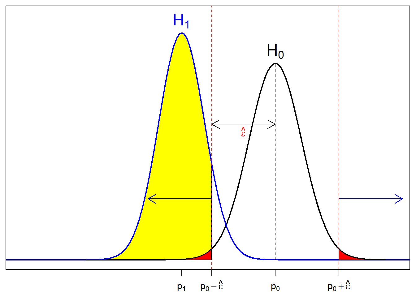
All we have to do is calculate area under \(H_1\) for x values smaller than \(p_0-\hat{\epsilon}\) and bigger than \(p_0+\hat{\epsilon}\).
I’ll try to derive a closed form formula by using \(\Phi\). Because the distribution of interest is from \(H_1\) now, the mean and the standard deviation used to calculate the standardized z-score will be of the alternative hypothesis, which are \(p_1\) and \(p_1(1-p_1)\).
\[z_{std} = \dfrac{\Big(p_0\pm\frac{\Phi^{-1}(\frac{\alpha}{2})\sqrt{p_0(1-p_0)}}{\sqrt{n}} - p_1\Big)}{\sqrt{\frac{1}{n}p_1(1-p_1)}} = \dfrac{\sqrt{n}(p_0-p_1)\pm\Phi^{-1}(\frac{\alpha}{2})\sqrt{p_0(1-p_0)}}{\sqrt{p_1(1-p_1)}}\]
Then \[1-\beta = \Phi\bigg(\dfrac{\sqrt{n}(p_0-p_1)-\Phi^{-1}(\frac{\alpha}{2})\sqrt{p_0(1-p_0)}}{\sqrt{p_1(1-p_1)}}\bigg) + \\ \Bigg(1 - \Phi\bigg(\dfrac{\sqrt{n}(p_0-p_1)+ \Phi^{-1}(\frac{\alpha}{2})\sqrt{p_0(1-p_0)}}{\sqrt{p_1(1-p_1)}}\bigg)\Bigg)\]
The formula may seem a little complicated, but the values inside \(\Phi\) just a result of unstandardizing the standardized cutoff value to the scale null distribution, then standardizing it from the scale of the alternative distribution.
There you have it. This is a way to calculating the power.
Observation of Power’s Behavior
I’d also like to see the behavior of the power function with respect to sample size, \(n\), and the magnitude of difference between \(p_0\) and \(p_1\).
Against Sample Size
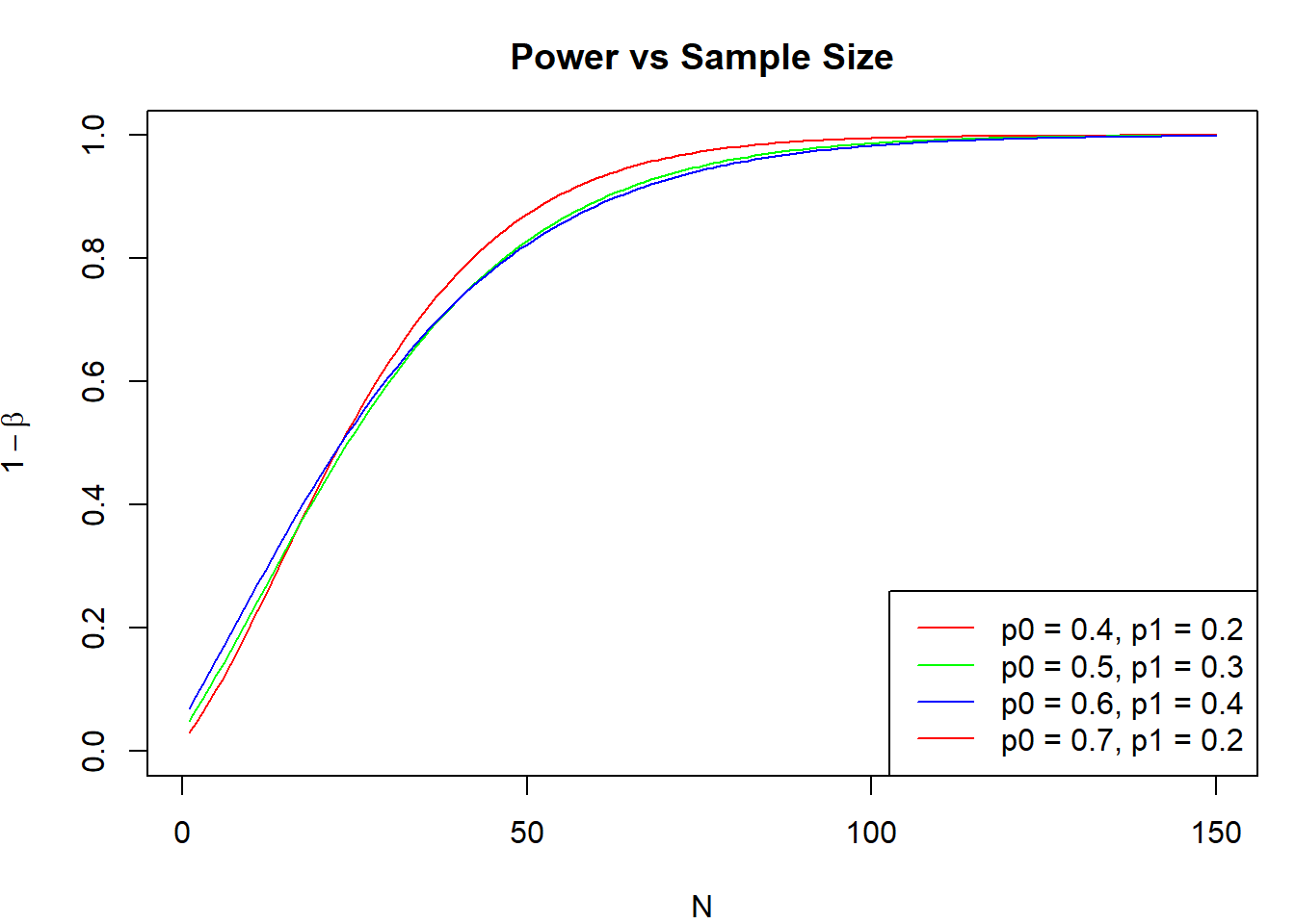 As you can see here, at varying values of \(p_0\) and \(p_1\), the power increases monotonically with the sample size. Eventually, when the sample size is big enough, the power to detect change will be close enough to one.
This has its own problem though.
Imagine that the true \(p\) for a test is 0.55, and you want to test for a null hypothesis \(p_0 = 0.5\). Let’s see how power behaves with respect to the sample size.
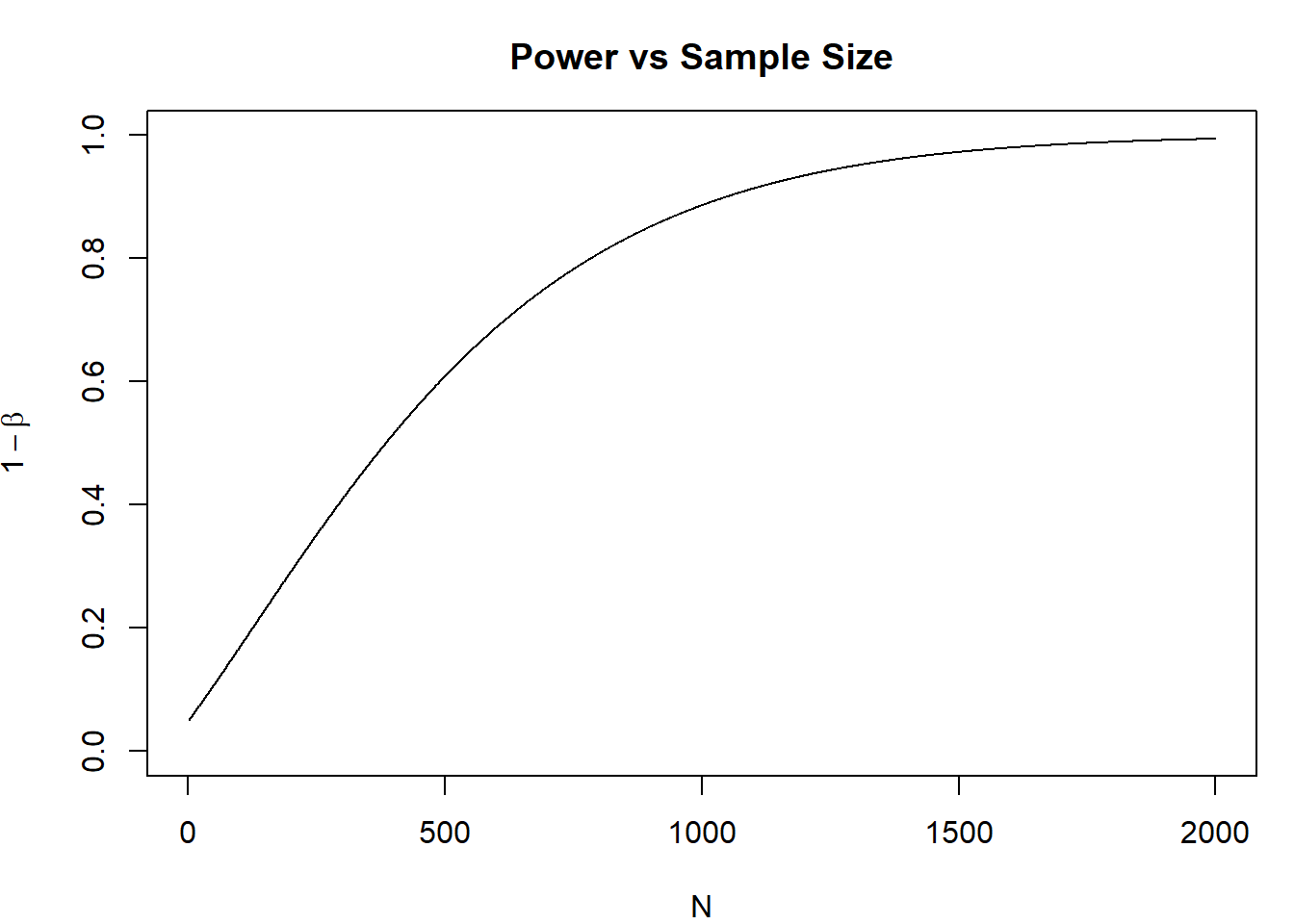
Depending on the type of study, a difference of 0.05 may or may not be of significant difference. The size of the difference that you see is called the effect size. The effect size that you desire to see may be bigger than 0.05. Given that you have enough samples, small effect size could reject null hypothesis. Even though the effect size is practically negligible, you can get a statistically significant result that leads you to think that there is evidence for a difference.
Against Distance Between \(p_0\) and \(p_1\)
Let’s see how the distance between hypothesis affect power. For distance, I calculated the absolute value of difference between \(p_0\) and \(p_1\). For example, \(p_0 = 0.5\) and \(p_1 = 0.6\) has the same distance as \(p_0 = 0.3\) and \(p_1 = 0.2\).
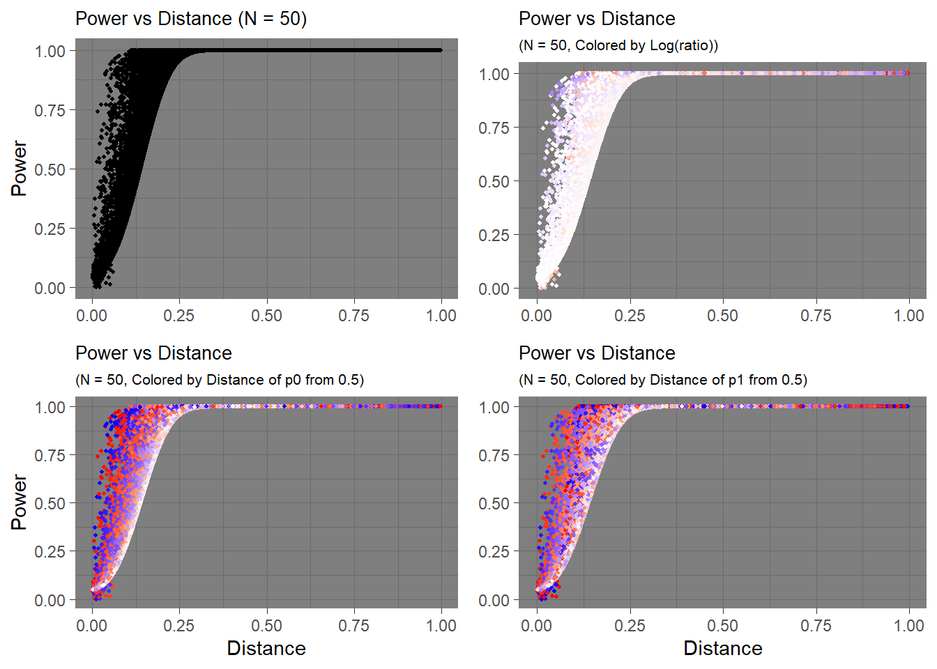
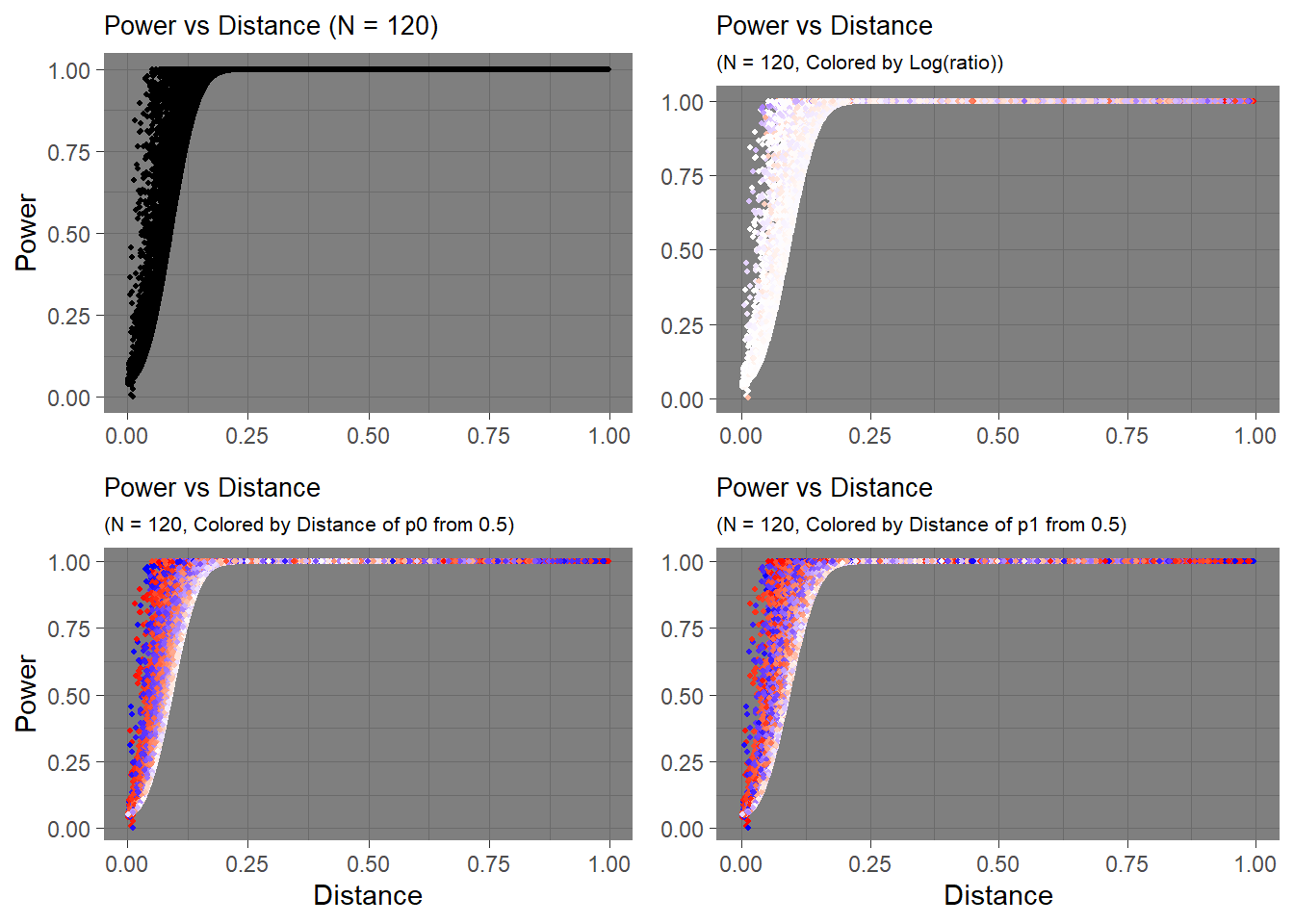
To calculate the powers per distance, I generated a sequence of \(p_0\) and \(p_1\) with an interval of 0.001, generated all combinations of the two proportions, measured the distance, and calculated power with \(p_0\), \(p_1\), and for sample sizes \(N = 10, 50, 100, 120\).
The data I created looks like this:
##           p0    p1 distance   power_10  power_50 power_100 power_120
## 242434 0.676 0.243    0.433 0.85403065 0.9999997 1.0000000 1.0000000
## 721038 0.759 0.722    0.037 0.07020518 0.1060772 0.1514675 0.1696854
## 533940 0.474 0.535    0.061 0.06699970 0.1385977 0.2306389 0.2673210
## 727341 0.069 0.729    0.660 0.99982690 1.0000000 1.0000000 1.0000000
## 333947 0.281 0.335    0.054 0.07912712 0.1488668 0.2363192 0.2707668
Instead of plotting all combinations of \(p_0\) and \(p_1\) at fixed intervals (0.001), I randomly sampled pairs and calculated power and distance due to large number of combinations. Although the graph will look like random data, the values are in fact deterministic, and the visible trend remains.
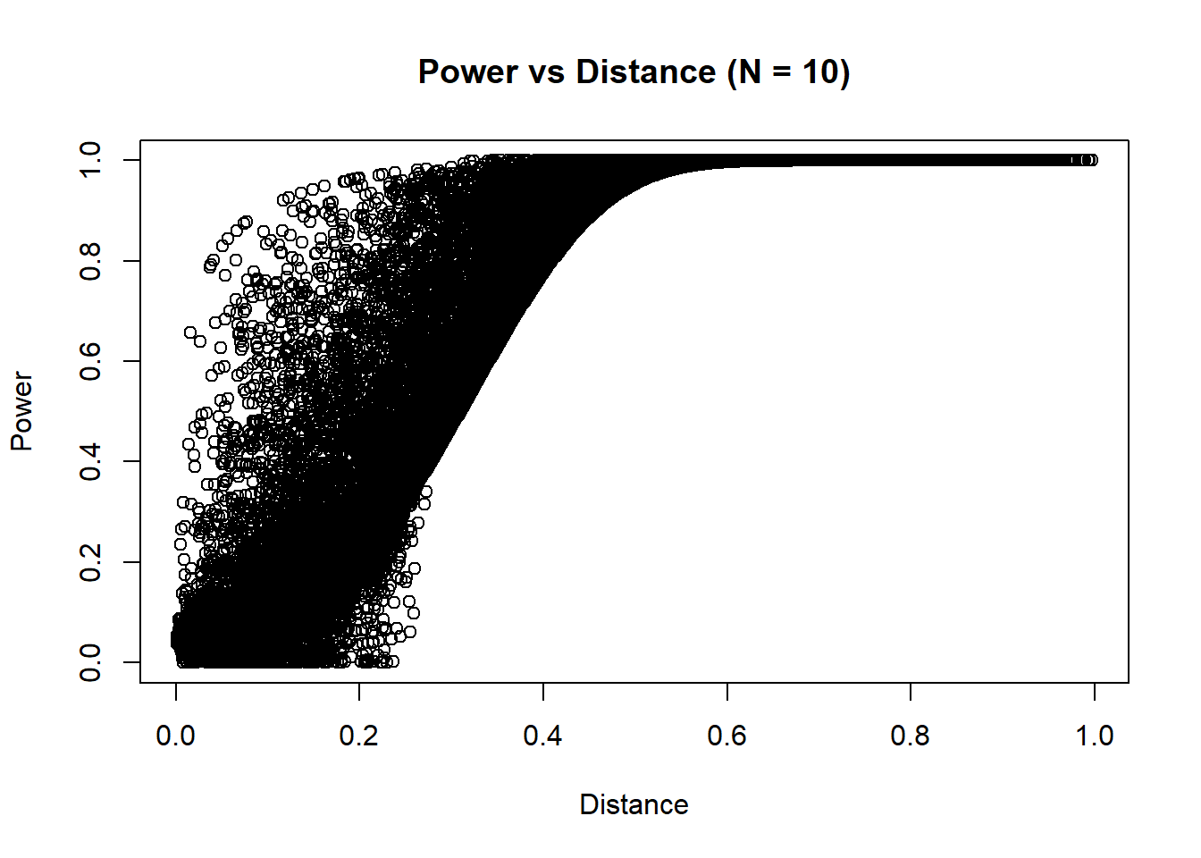
Hmm… It seems although the distance seems to have some influence on power, other factors also influence it. What is distance not capturing? For my previous example, I considered \(p_0=0.5,p_1=0.6\) and \(p_0=0.3,p_1=0.2\). Could the values themselves matter?
Let’s add another layer of visualizational dimension to the graph. My initial instinct was to calculate the ratio between two proportions, \(\frac{p_0}{p_1}\). However, take a look at the distribution of ratio from the data.
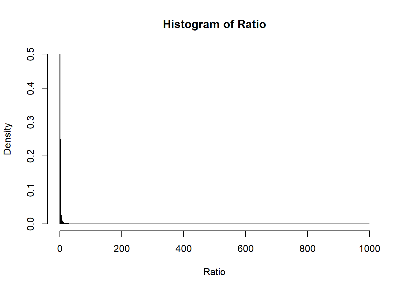
Using raw ratio won’t show much information if I do a linear mapping between color intensity and ratio since I won’t see much change in the ratio (especially since I sampled the points from the whole data).
If I apply log transformation, the distribution should look better.
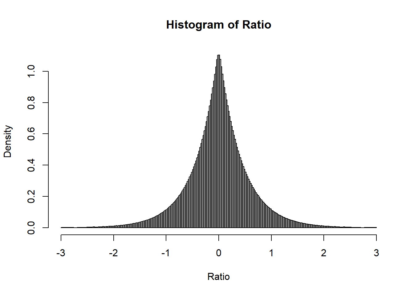 Let’s try mapping colors to these values.
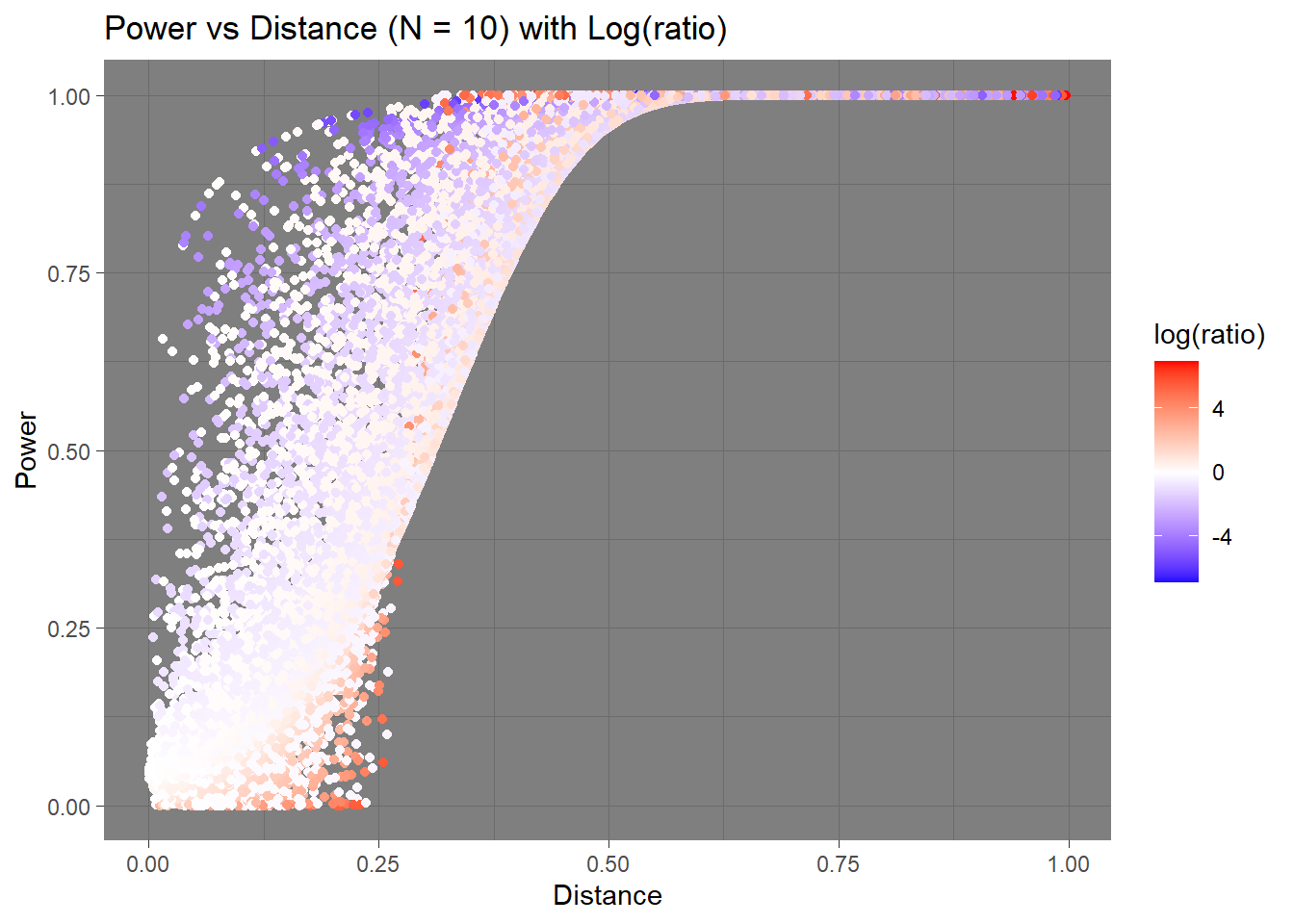
We can kind of see a trend here. It looks like larger absolute value of negative log-ratios is related to lower power when the distance is small. Upon quick inspection of the data, those values near 0 in power were those were the \(p_1\) were close to 0 or 1. It would be hard to capture those differences if that were the case in real life. The plot still seems overwhelmed by the “whiteness”, and the colors aren’t easily interpretable.
This time, I colored the data points depending on how close the point’s \(p_0\) is to the center, 0.5.
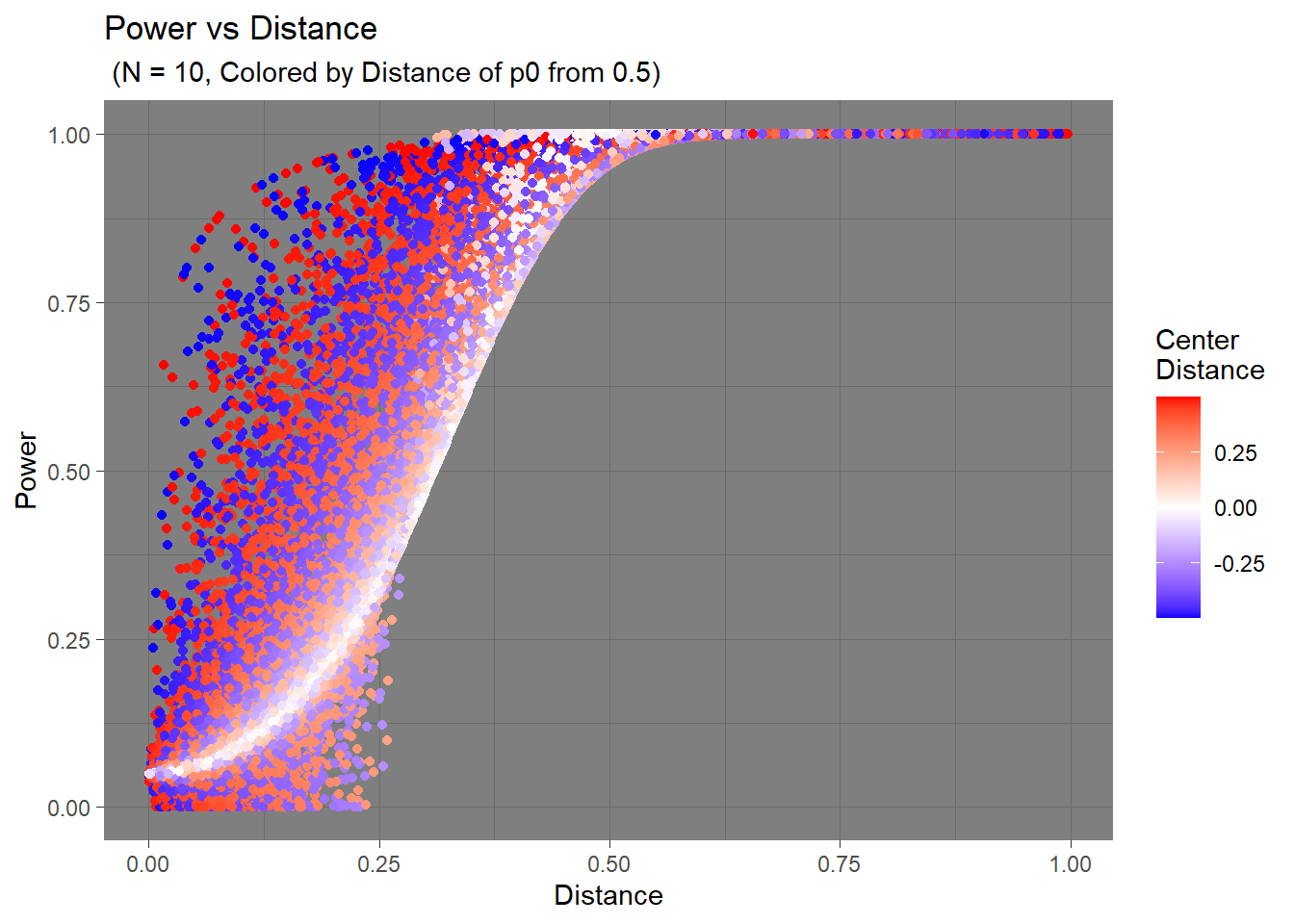
The trend seems to change before and after the distance between two hypothesis go over 0.25. When the distance is below the 0.25 cutoff, the deviation of \(p_0\) from 0.5 can either make the power increase or decrease. However, after that cutoff, the deviation seems to always increase the power.
Then what is happening before the cutoff that makes the power decrease when at the other points the power increases?
To get myself closer to an answer, I plotted the distance of \(p_1\) from 0.5, and here’s what I got.
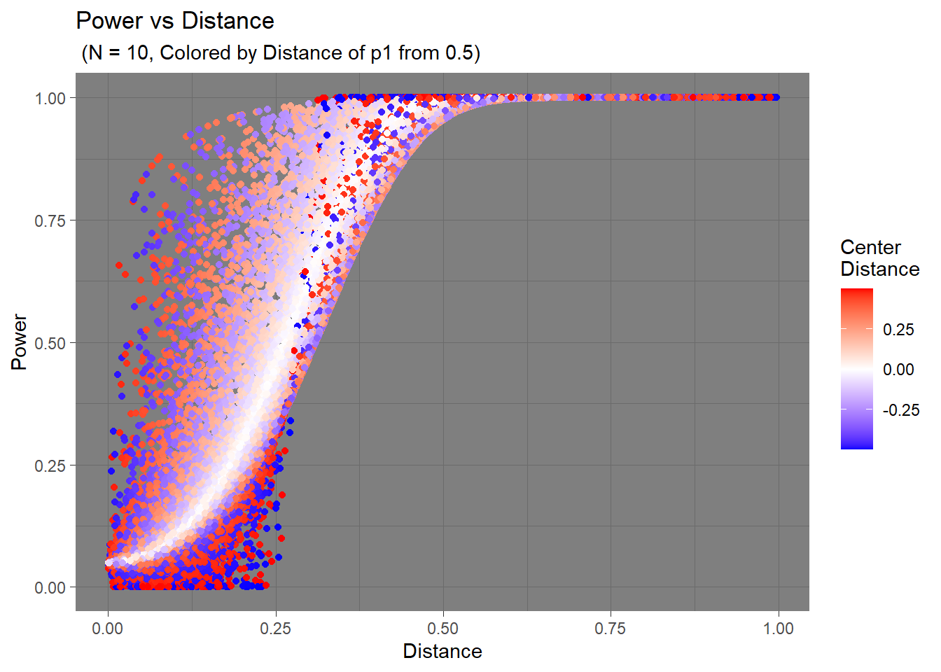
I think the trend is much more apparent here. As I mentioned before, those lower power values are related to \(p_1\) being close the the extreme values. The colors are noticeably more solid in the bottom area compared to the top area, indicating further distances from the center. This should mean that when \(p_1\) is hypothesized to be near 1 or 0, the statistical tests would have a harder time detecting that real change.
These observations are relevant to when the sample size is really small (N = 10). The effects become more and more negligible as sample size increases.
N = 50
N = 100

N = 120
Wrap-Up
In this post, I wrote about the definition and intuition behind power, comparison with respect to significance level \(\alpha\), calculation of power, and its behavior with sample size, effect size, and significance level. I explored the change in power with various factors with several visualization tools (ggplot2) and techniques. Although the example case was very basic, I hope this post has helped in getting better understanding about power because I think it’s a useful, if not important, factor to consider when conducting an experiment.